Understanding the Basics of Forex Charts
Forex charts serve as vital tools for day traders who seek to exploit short-term market movements. These charts graphically depict the price action of currency pairs over a defined period, allowing traders to identify trends, patterns, volatility shifts, and potential trading signals. In the decentralized foreign exchange market, where prices fluctuate continuously due to global economic activity, charts provide structure and clarity. They convert raw pricing data into an organized visual format that can be analyzed systematically.
At their core, forex charts represent the interaction between supply and demand. Each movement on a chart reflects the collective decisions of banks, institutions, corporations, governments, and retail traders. By studying recurring behaviors in price movements, traders attempt to anticipate future price action. Although charts do not predict the future with certainty, they provide a framework for assessing probabilities and managing risk.
Types of Forex Charts
Forex traders rely on three primary types of charts to analyze market data: line, bar, and candlestick charts. Each chart type presents price information differently, influencing how traders interpret market conditions.
Line Charts: Line charts are straightforward and easily interpretable. They connect the closing prices of a currency pair over a specific time frame, giving a clear picture of the overall price trend. Because they omit intra-period highs and lows, line charts emphasize general direction rather than detailed volatility. This simplicity makes line charts accessible, especially for novice traders who may find other chart types complex at the outset.
Line charts are often used to identify longer-term trends. For example, a trader observing a daily line chart over several months can quickly determine whether a currency pair is in a sustained uptrend, downtrend, or moving sideways. By removing noise, line charts highlight broad structural movements in price.
Bar Charts: Bar charts present a more detailed view of price action. By incorporating information about opening and closing prices, as well as high and low prices, bar charts offer a comprehensive snapshot of market movements within each period. The vertical line represents the full price range for that interval, while small horizontal marks indicate the opening price (on the left) and closing price (on the right).
This structure enables traders to evaluate volatility within each period. A long vertical bar suggests substantial price movement, while shorter bars indicate consolidation. By comparing consecutive bars, traders can detect increasing or decreasing momentum and identify shifts in buying or selling pressure.
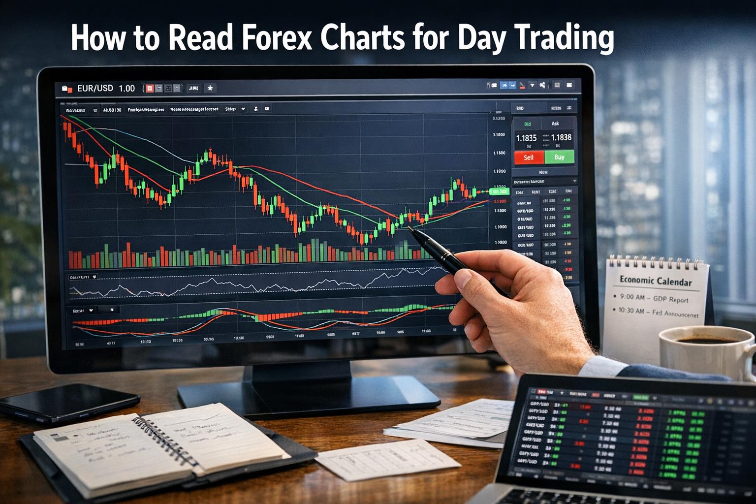
Candlestick Charts: Favored by many traders, candlestick charts convey the same data as bar charts but in a more visually structured format. The body of a candlestick represents the range between the opening and closing prices, while the wicks (or shadows) indicate the high and low prices within the period. Color differences typically distinguish bullish periods from bearish ones.
Candlestick charts originated in Japanese rice markets and remain widely used because of their clarity. The size of the body communicates the strength of buyers or sellers, while the length of shadows can reveal rejection of higher or lower prices. Traders often interpret candlesticks individually and in clusters to assess short-term sentiment shifts.
Key Elements of Forex Charts
Understanding and skillfully interpreting various elements of forex charts is essential for traders who wish to leverage the full potential of these analytical tools.
Timeframes: A critical aspect of forex charts is the timeframe over which they are plotted. Timeframes range from one minute to one month or longer. Short timeframes, such as 1-minute or 5-minute charts, display granular price movement and are typically used by scalpers and day traders. Longer timeframes, such as daily or weekly charts, provide broader market context.
The same currency pair can appear to trend upward on a daily chart while moving sideways on a 15-minute chart. This difference highlights the importance of multi-timeframe analysis. Many traders consult higher timeframes to determine the dominant trend and then use lower timeframes to refine entries and exits.
Price Levels: An integral part of technical analysis, price levels are depicted using horizontal lines on a chart to indicate areas where price has historically reacted. These levels are commonly referred to as support and resistance.
Support represents a price area where buying interest has previously outweighed selling pressure, preventing further declines. Resistance represents an area where selling pressure has capped upward movement. When price revisits these areas, traders monitor price behavior closely. A breakout above resistance or below support can signal continuation, while rejection may signal reversal.
Trend Lines and Channels: Beyond horizontal levels, traders draw diagonal trend lines that connect a series of higher lows in an uptrend or lower highs in a downtrend. Trend lines help visualize directional bias and dynamic support or resistance. Extending these lines parallel to one another creates price channels, which outline the boundaries within which price oscillates.
Channels can be ascending, descending, or horizontal. Observing how price behaves within channels allows traders to anticipate potential continuations or disruptions of the prevailing trend.
Chart Patterns: Repeated historical price movements can form recognizable patterns on forex charts. Patterns such as head and shoulders, double tops and bottoms, and triangles provide traders with structured interpretations of market psychology.
A head and shoulders formation, for instance, can signal a potential trend reversal following an extended move. Double tops and bottoms indicate strong resistance or support tested multiple times. Triangles reflect periods of consolidation that often precede breakout movements. Recognizing these formations requires consistent observation and confirmation through volume or momentum indicators.
Indicators and Tools
Traders can apply a variety of technical indicators and tools to forex charts to refine their analysis. Indicators are mathematical calculations derived from price, volume, or volatility data. While they do not guarantee outcomes, they provide structured methods for evaluating conditions.
Moving Averages: Moving averages smooth out price fluctuations to highlight trend direction. A simple moving average (SMA) calculates the average price over a set number of periods, while an exponential moving average (EMA) gives greater weight to recent prices.
Moving averages can act as dynamic support or resistance levels. Traders often monitor crossovers between short-term and long-term averages to identify shifts in momentum. For example, when a short-term moving average crosses above a longer-term one, it may indicate strengthening upward momentum.
Relative Strength Index (RSI): RSI is an oscillator that measures the velocity and change of price movements. It ranges from 0 to 100. Readings above 70 typically indicate overbought conditions, while readings below 30 suggest oversold conditions.
Rather than using RSI as a standalone trigger, many traders combine it with trend analysis. For example, in a strong uptrend, RSI may remain elevated for extended periods. In such cases, oversold readings within the broader uptrend may present opportunities aligned with the prevailing direction.
Bollinger Bands: Bollinger Bands consist of a central moving average and two outer bands plotted at standard deviation levels above and below that average. These bands expand during high volatility and contract during low volatility.
When price approaches the outer band, traders evaluate whether the movement signals continuation or potential reversal. Band contraction, often called a “squeeze,” may precede larger price moves as volatility returns to the market.
MACD (Moving Average Convergence Divergence): The MACD is another momentum indicator that measures the relationship between two moving averages. It consists of a MACD line, a signal line, and a histogram representing the distance between them. Crossovers and divergence between MACD and price action can provide insights into possible trend changes.
Using Forex Charts for Day Trading
Day traders rely heavily on forex charts to determine optimal entry and exit points within the same trading session. Because positions are typically closed before the market day ends, accuracy in timing is essential.
A structured approach to day trading often begins with identifying the broader trend on a higher timeframe, such as the hourly chart. The trader then shifts to a lower timeframe, such as the 5-minute or 15-minute chart, to pinpoint precise entries. This integration of multiple perspectives helps minimize trades taken against dominant market direction.
Risk management is directly connected to chart interpretation. Stop-loss orders are frequently placed beyond recent swing highs or lows, trend lines, or support and resistance levels. These placements are based on observable price structures rather than arbitrary distances.
Day traders also monitor periods of increased liquidity, such as the overlap between major trading sessions. Charts often show higher volatility during these windows, providing expanded opportunity but also increased risk. Observing how price reacts to key levels during high-volume sessions can offer additional confirmation.
Furthermore, traders must remain attentive to scheduled economic releases and geopolitical developments. Interest rate decisions, inflation data, and employment reports frequently generate abrupt chart movements. Technical patterns may temporarily lose reliability during major news events, requiring caution and disciplined risk controls.
Developing proficiency with forex charts involves practice and documentation. Many traders maintain trading journals that include annotated screenshots of charts, recording the reasoning behind each trade. Reviewing these records can strengthen pattern recognition and improve consistency over time.
Forex charts should not be interpreted in isolation. Market context, including macroeconomic trends and monetary policy direction, contributes to currency valuation. Technical analysis provides structure, while fundamental awareness enhances understanding of underlying drivers.
For individuals seeking deeper knowledge of chart analysis techniques, educational resources such as Investopedia provide structured explanations and examples. Engaging with trading communities and reviewing historical charts can further reinforce learning.
By understanding chart types, mastering essential elements, applying indicators thoughtfully, and integrating risk management principles, traders can use forex charts as systematic tools rather than speculative instruments. Consistent application of methodical analysis enables traders to interpret price movements within a disciplined framework suited to the dynamic nature of the foreign exchange market.
This article was last updated on: March 28, 2026